percolatehq: Check out this visual map that shows 24 hours of…
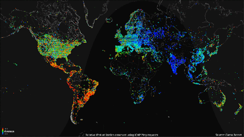
Check out this visual map that shows 24 hours of internet usage around the world — Tech News and AnalysisMap of 24 hrs of internet usage around the world. Imagine what it will look like in 5 years