percolatehq: Check out this visual map that shows 24 hours of…
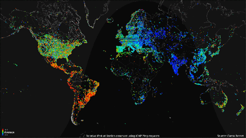
Check out this visual map that shows 24 hours of internet usage around the world — Tech News and AnalysisMap of 24 hrs of internet usage around the world. Imagine what it will look like in 5 years
trendgraphy: 100 Diagrams That Changed the World by Scott…
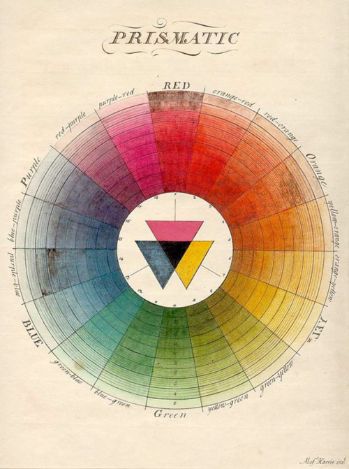
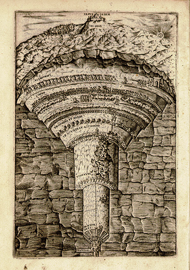
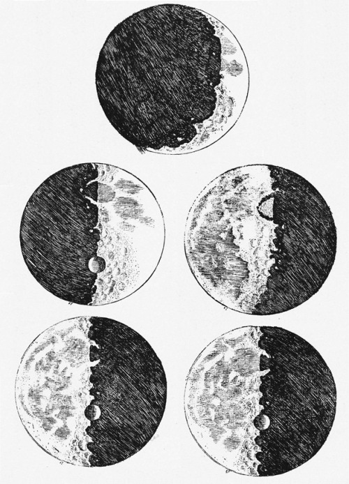
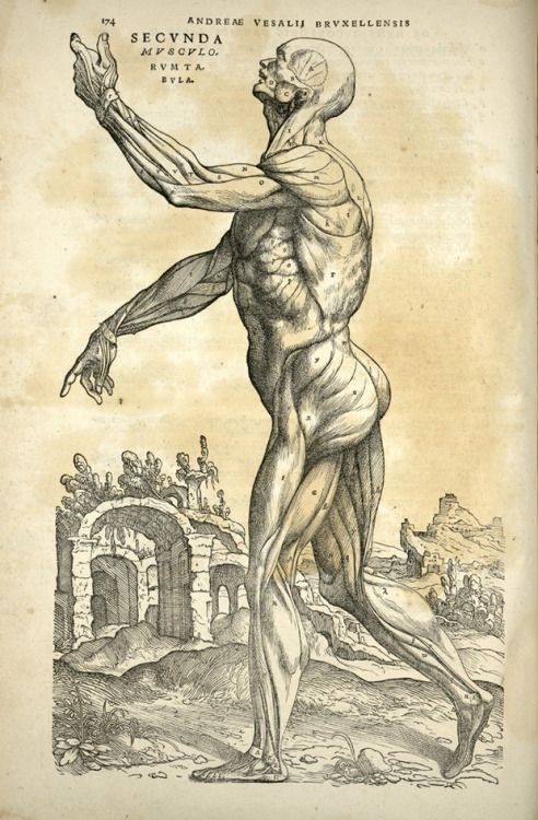
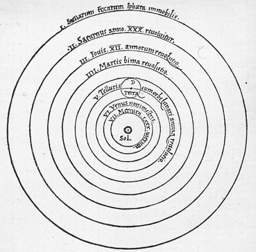
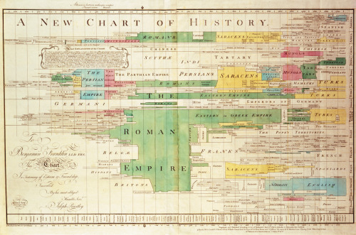
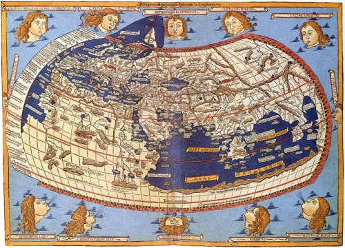
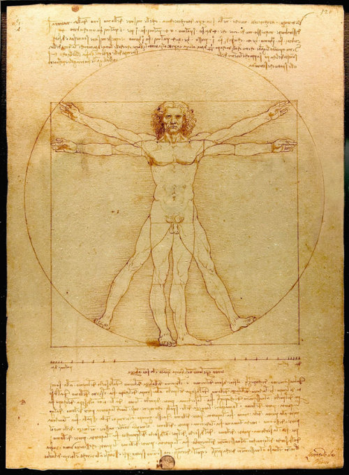
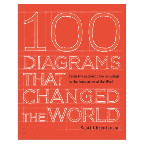
100 Diagrams That Changed the World by Scott Christianson.
From The Earliest Cave Paintings to the Innovation of the iPod
Infographics are cool (and trending) but you know what is cool? 100 most important diagrams that changed the human history, Scott Christianson decide to compile the most awesome diagrams in this book: do you think that prismatic circle that you see on photoshop is a creation from Adobe?, well Moses Harris did it in 1766, do you remember Dante’s Inferno?, well there’s a diagram for that, phases of the moon? Yeah Galileo did it, and of course Da Vinci’s Vitruvian Man is there too.Here’s you can check the book: http://amzn.to/19oHynn
(via brain pickings)
globalvoices: Visual.ly maps the protests in Turkey based on a…
globalvoices:
Visual.ly maps the protests in Turkey based on a compilation of news reports.
futurejournalismproject: theparisreview: This series of…
futurejournalismproject:
theparisreview:
This series of infographics, illustrating how different parts of the country say different things, is fascinating. Below: mayonnaise.
FJP: Neat.